SW: Branding a Cycling Movement
Goal
Build a full brand identity and visual system for a new platform connecting amateur cyclists through events, news, and exclusive benefits.
Our role
Creative direction, visual identity, event branding, and web UI design.
Outcome
A scalable brand architecture with a dynamic logo system, color and typography guidelines, event branding, print and apparel design, and a performance-driven website experience.
Year
2021
Cycling isn't just a sport, it's a lifestyle. And for those who live and breathe the thrill of the ride, SW was created to be more than a brand. It’s a growing ecosystem for amateur cyclists in Brazil – part media hub, part community, part challenge series.
From road to screen, we partnered with the SW team to design a brand that could capture speed, energy, and structure – all while being flexible enough to house multiple sub-brands and experiences.
A Platform with Purpose
SW was envisioned as a central platform for cyclists – combining news, gear, social engagement, and competition into one universe. Our mission was to give that idea a distinct voice: fast, sharp, and accessible.
We designed a full brand system that could stretch from editorial content to performance jerseys, from digital leaderboards to asphalt signage.
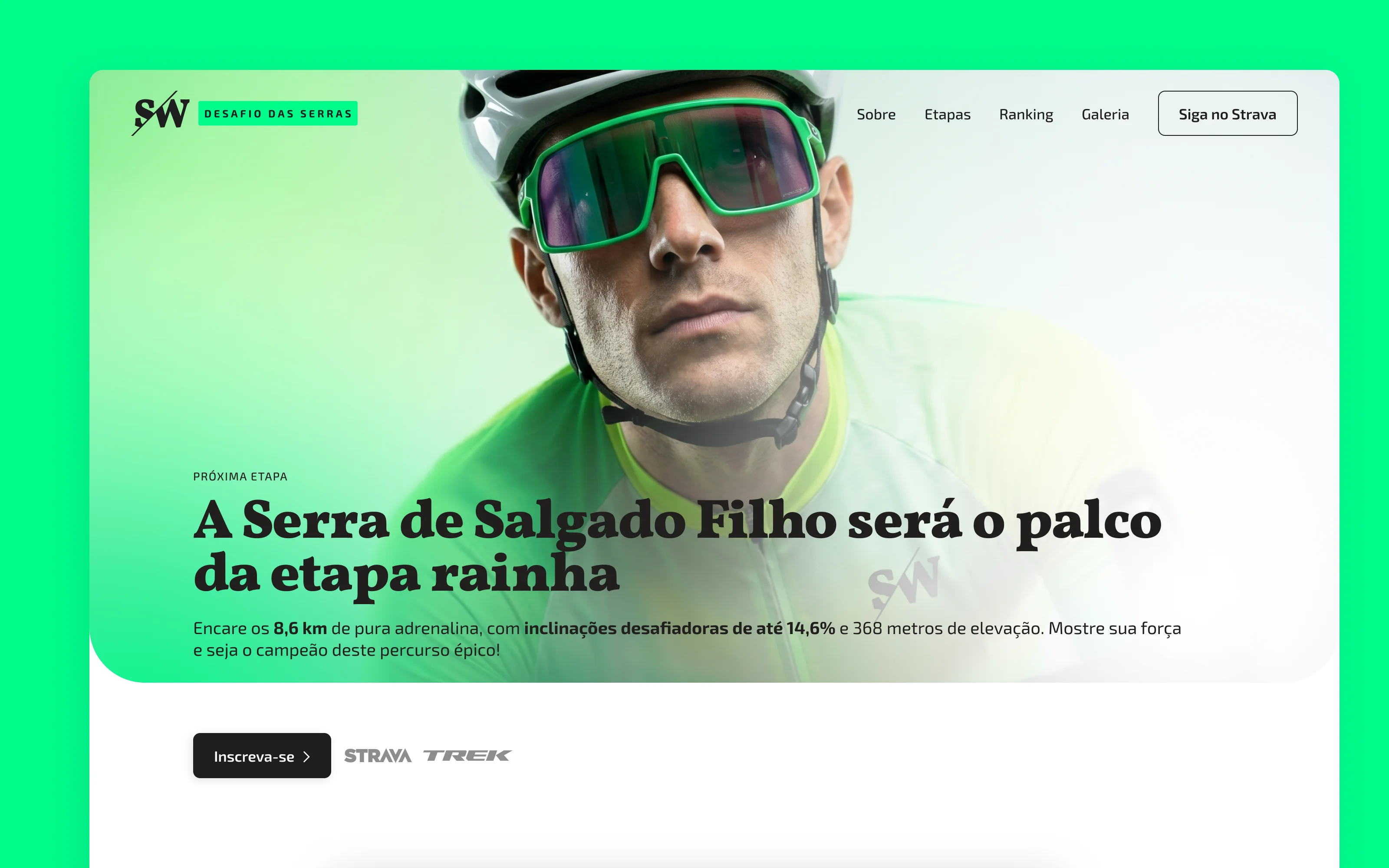
The Logo: Built for Speed
The core SW mark is a bold serif wordmark sliced by a diagonal lightning bolt symbolizing speed, sharpness, and the SouthWest direction. It immediately feels energetic and assertive, but still timeless.
This symbol becomes the unifying visual signature across all sub-brands and applications.
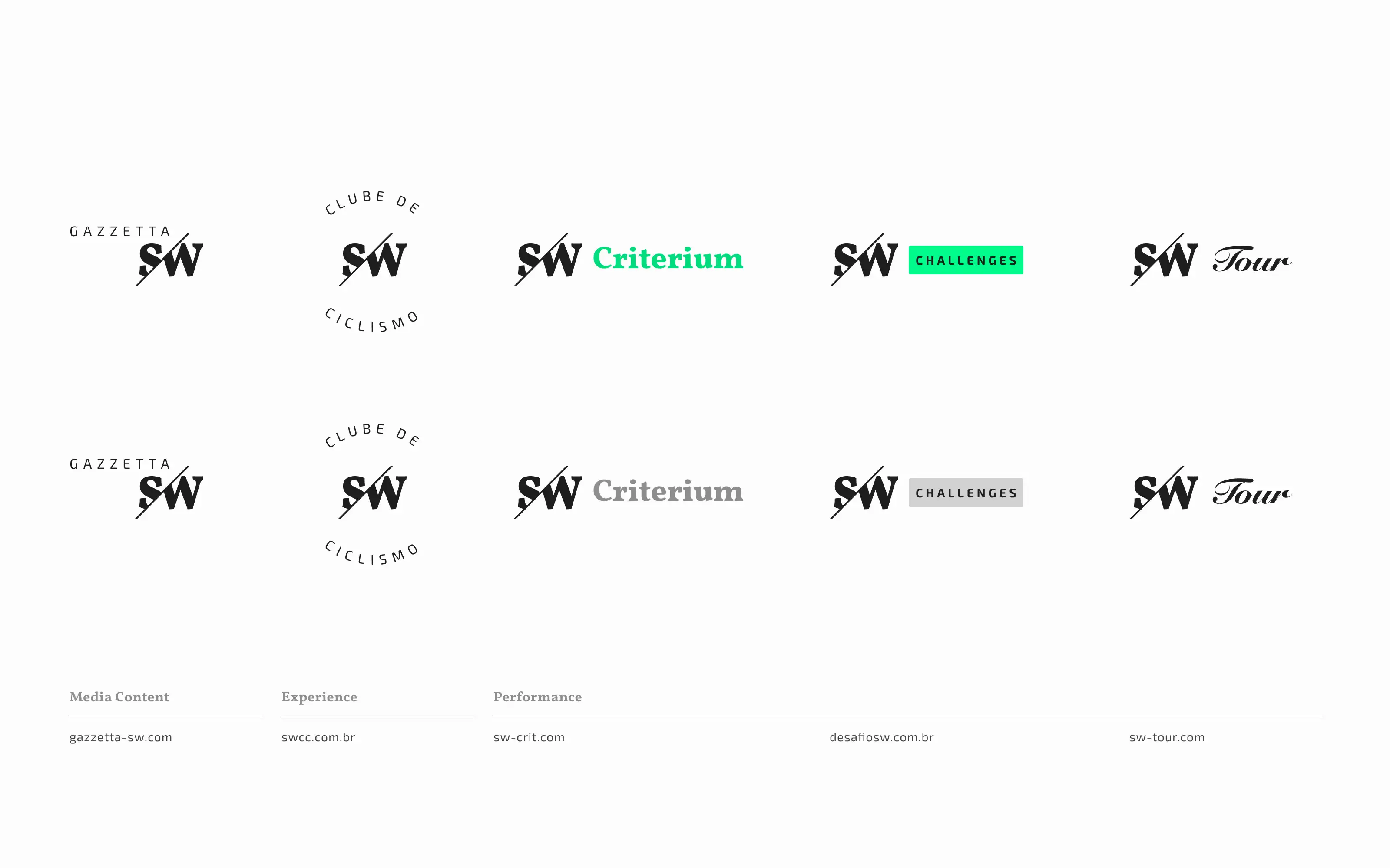
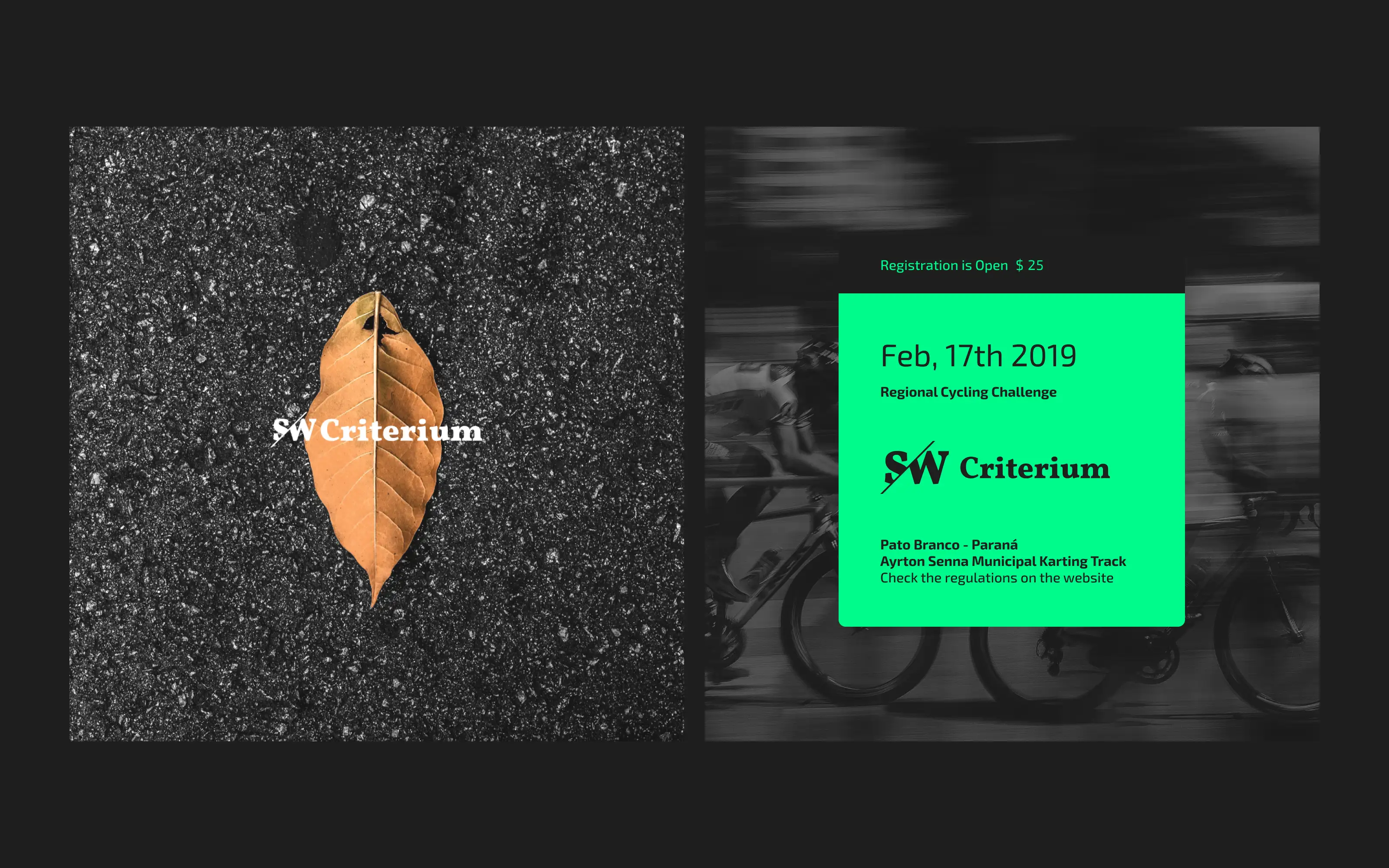
Iconic Sub-brands
SW isn't just one thing. It’s a family of initiatives:
SW Gazzetta: cycling news and content
SW Criterium: speed-focused closed-circuit races
SW Desafio das Serras: uphill Strava-integrated challenges
SW Tour: a multi-stage road cycling race
SW Challenges: themed events and virtual missions
Each identity maintains the SW DNA while adapting to its own context.
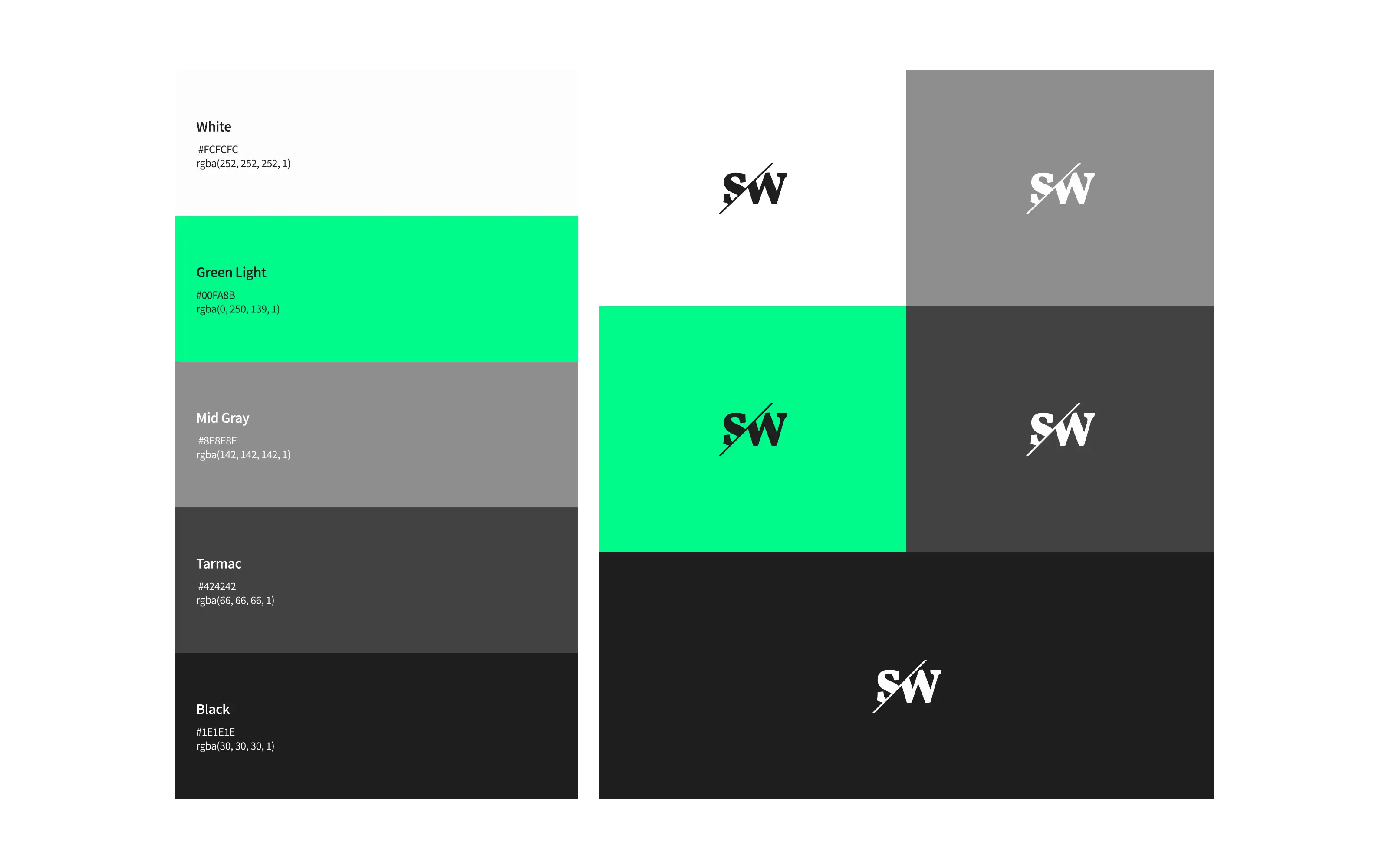
A High-Contrast, Road-Ready Palette
The color system reflects SW's connection to the road: asphalt blacks and grays meet a vivid, almost electric green – named Green Light – bringing contrast and attention to event calls, CTAs, and branded gear.
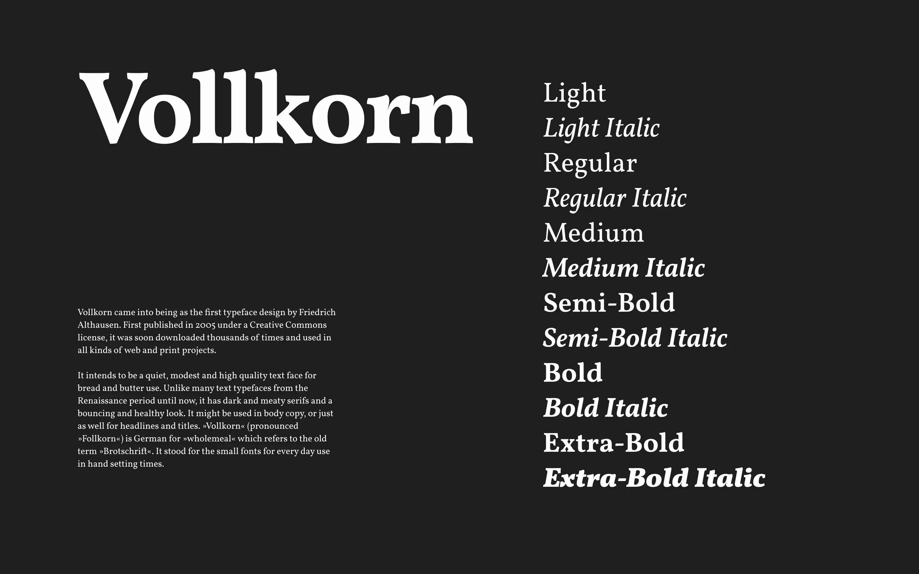
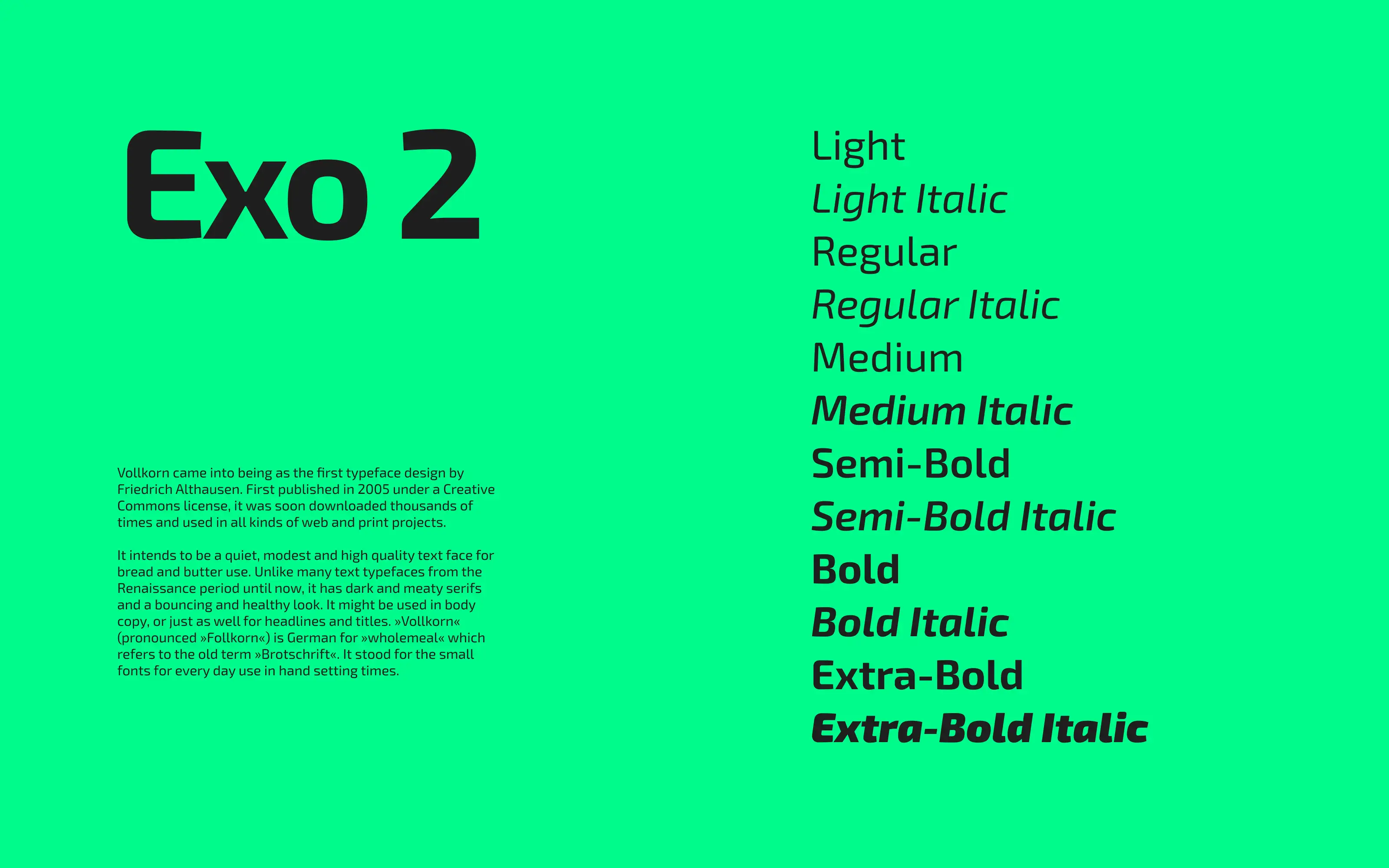
Typography: Vollkorn + Exo 2
We paired Vollkorn, a high-contrast serif with character and heritage, with Exo 2, a digital-native sans-serif built for clarity and agility. This combination gave us a way to shift between editorial tone and sporty utility, perfect for performance-focused experiences.
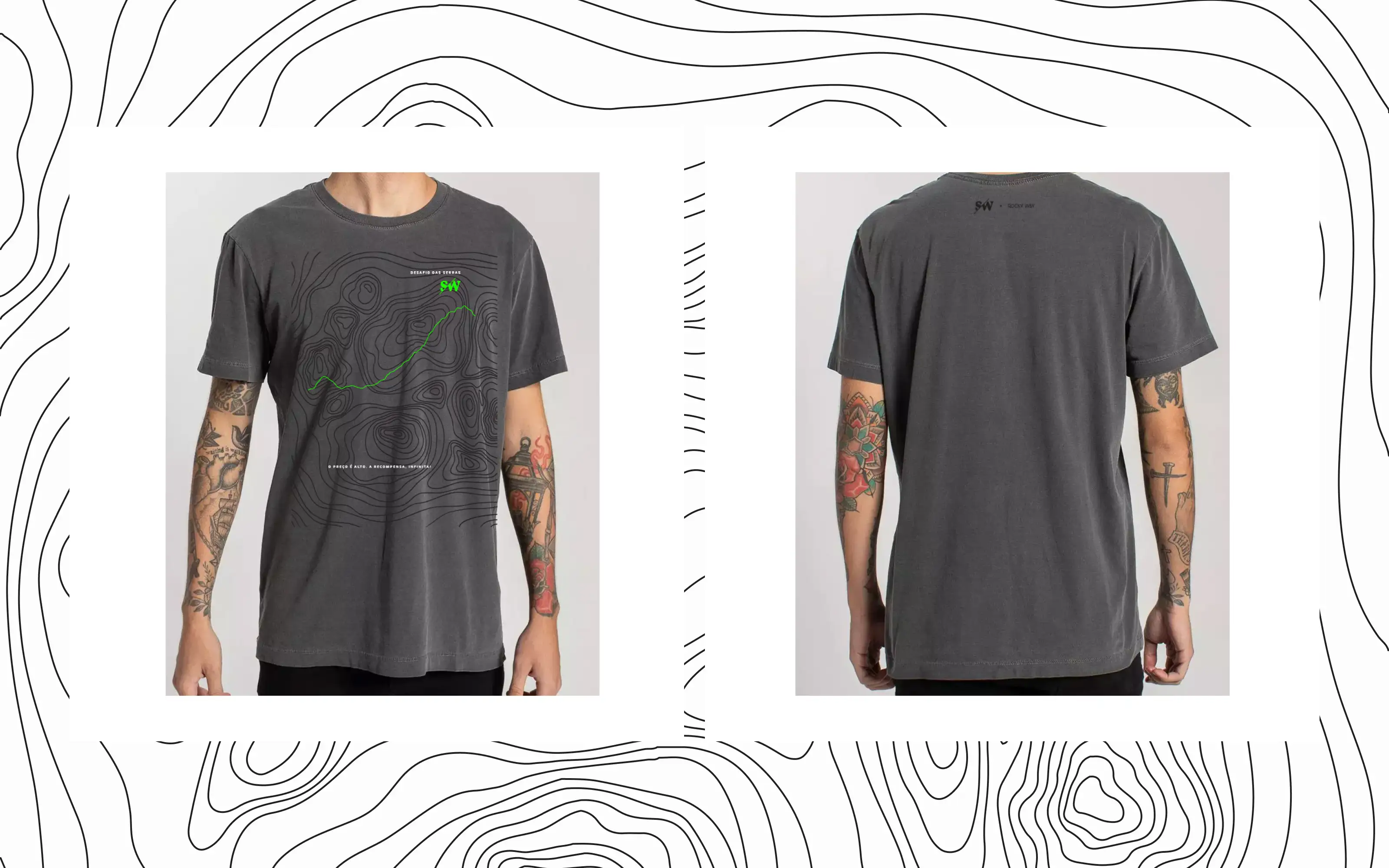
Event Branding & Merch
From posters to cycling kits, SW’s events demanded bold visuals that riders would remember. We created both print and digital assets for SW Criterium and Desafio das Serras, plus cycling jerseys and lifestyle apparel for participants.
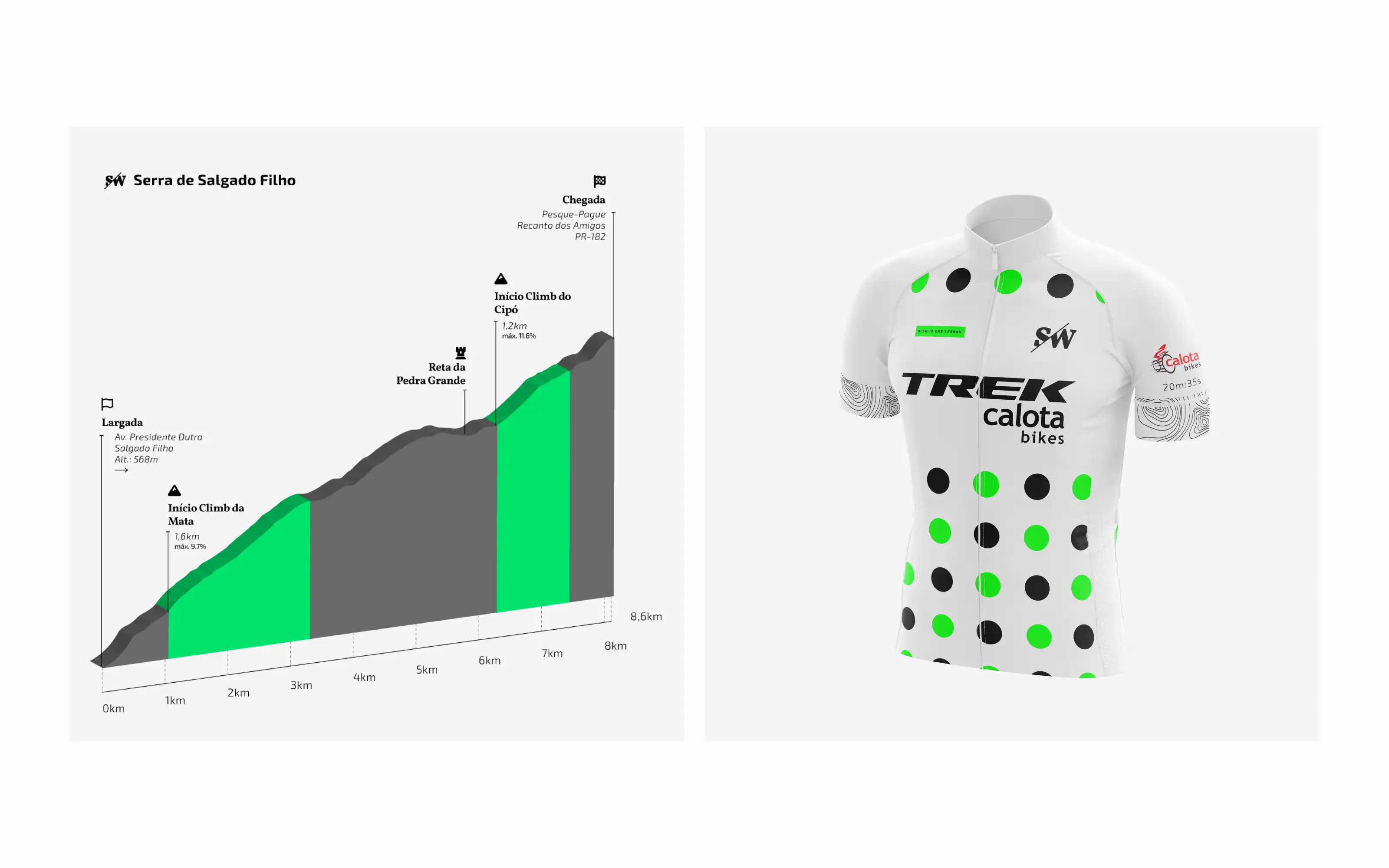
Digital Experience
We designed a custom web experience for SW’s events – with a focus on performance, motivation, and clear calls to action. The Desafio das Serras site integrates rider info, event elevation maps, and rankings, all within a modern UI tailored to mobile-first users.
Final Words
SW is a brand built to move. With a sharp, high-contrast identity and flexible visual system, it connects a growing cycling community under one name. From content to competition, every detail was designed for momentum.